EXECUTIVE SUMMARY
Using Digital Dashboards to Strengthen a Media Movement: The Experience of MTV Staying Alive Foundation
The MTV Staying Alive Foundation (MTV-SAF) is a media movement that uses storytelling to save lives. MTV-SAF creates groundbreaking content to improve young people’s health and reaches audiences in more than 72 countries. The team at MTV-SAF has always believed in using evidence to inform content and evaluate progress, but evidence wasn’t centralized and there was no way to seamlessly
bring data together.
Databoom partnered with Visualst and MTV-SAF to create a user-friendly data management system to empower MTV-SAF’s data-based decision-making. The final product enables MTV-SAF to think differently about engaging audiences, communicating evidence, and monitoring and evaluation.
SERVICES
- Design Thinking
- Data Visualization
- Consumer Insight
- Strategic Communications

“That’s where we came in.”
Databoom teamed up with partners Visualst and MTV-SAF to create a user-friendly data management system to empower MTV-SAF’s data-based decision-making.
MTV-SAF needs evidence to inform campaign content, monitor audience reach and engagement, and evaluate changes in beliefs, attitudes, and behavior among target audiences. MTV Shuga is MTV-SAF’s key campaign. It is a multi-award-winning behavior change campaign that uses a soap opera format to address topics like family planning, STI prevention, HIV and AIDs, safe and legal abortions, and gender-based violence. MTV Shuga’s messaging is disseminated through television and radio, social media, and peer education. Audiences can engage with content online, call hotlines, and respond to polling questions.

While MTV-SAF had a great deal of data, it was owned by different staff, housed in different places, inconsistently digitized, and not always comparable. This made it difficult to draw insights from evidence and use data to inform
decision-making.
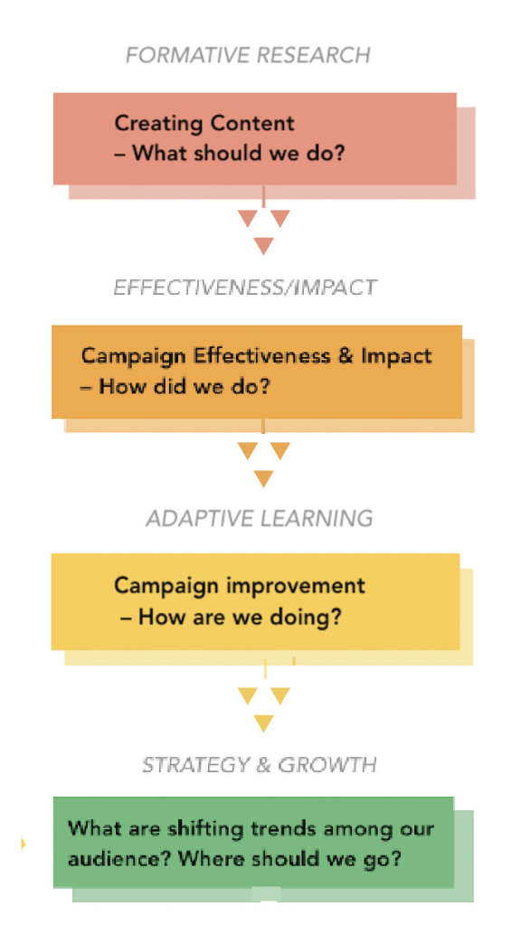
We worked with our partners to address these challenges by first investing in upfront thinking – advanced planning to identify MTV-SAF’s requirements from their MEL system. We identified the specific problems MTV-SAF was trying to solve with data, outlined our role in the solution, and developed a framework to inform data flow before proceeding to building tools.
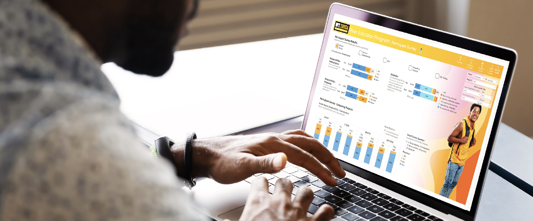
Building the data management system and dashboards involved several steps. First, we generated digitized data where needed; for example, peer education reports that had only been available in hard copy. Then we mapped data sources, variables, and the frequency of reporting to the system and synthesized data from five different sources: broadcasting, polling, social media, peer education sessions, and a peer education survey.
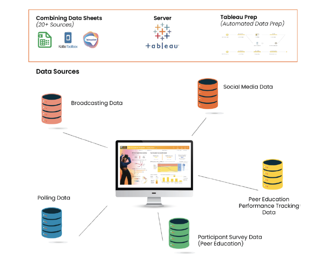
Next, we combined the data into Excel sheets in Tableau and then migrated the data to MTV-SAF’s server to allow for automated data preparation and cleaning. We ran descriptive statistics and created machine algorithms to tag comments in social media. Throughout the process, we tested and refined the visualizations with MTV-SAF decision-makers to ensure that the dashboards and display would fit their needs.
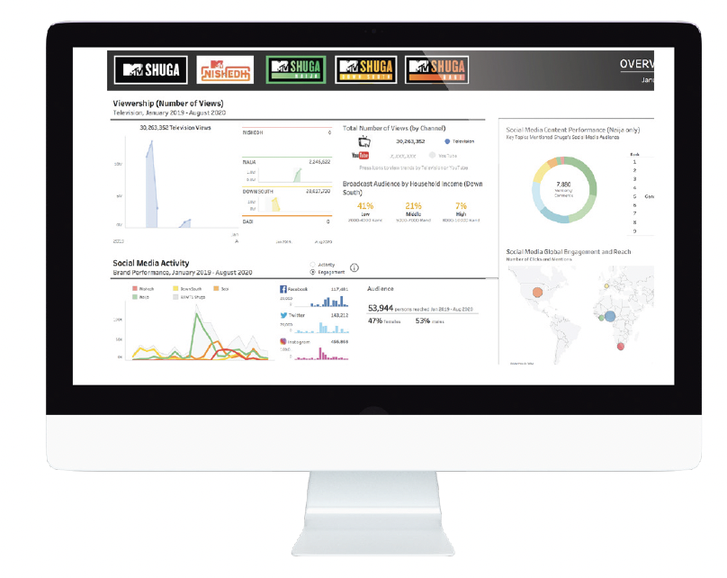
The home page serves as a global dashboard. It allows MTV-SAF decision-makers to compare campaigns and see performance across countries. The navigation labels at the top also allow decision-makers to filter results by time.
They can answer questions, like:
- How is viewership in each country and over time?
- Is Shuga getting more views on traditional broadcasting or online?
- How are audiences engaging online?
- What are they talking about?
- Where are people watching?
When decision-makers click on the country campaign buttons, they can view performance at a country level.
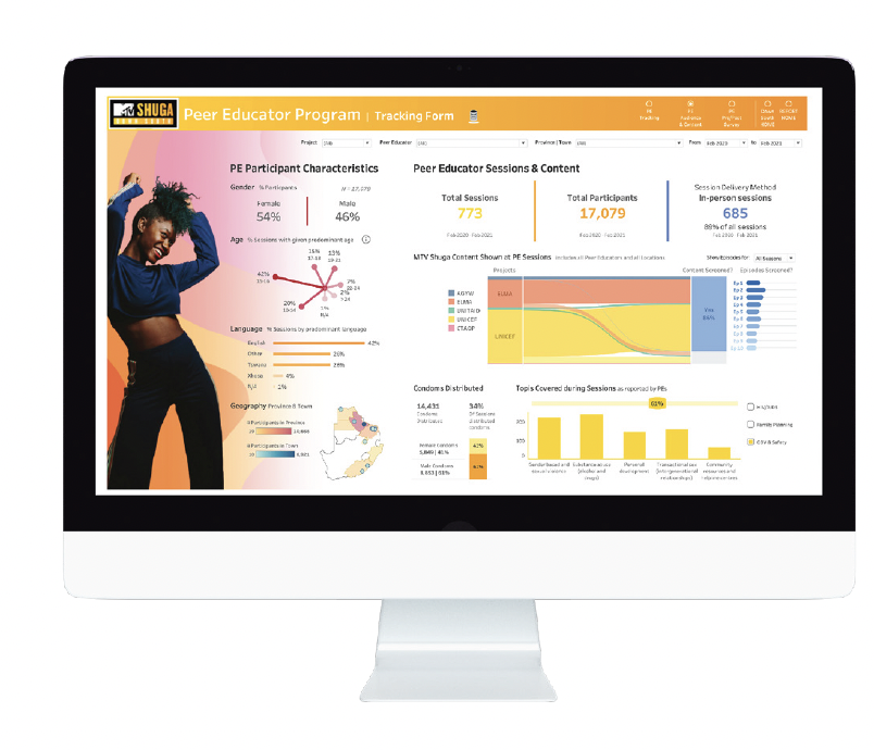
On this peer education page, they can answer questions, like:
- What’s the demographic make up of peer education
participants? - How many sessions have been conducted to date?
- How many total participants have there been?
- Which topics were covered?
- Did they receive condoms or a needed service?
Decision-makers can also disaggregate results by project and donor to understand differences in campaign performance.
In addition to desktop views, dashboards are optimized for viewing on mobile phones, so decision-makers can readily access results in the field. The final step in the project was to build capacity among leadership, program staff, and the communications team to synthesize, analyze, and, most importantly, use results.
IMPACT
Data visualization has made data more accessible (and less intimidating) for staff to use. Timely analytics allow MTV-SAF to monitor each country campaign, compare campaigns over time, and pivot programming as needed. At the country level, dashboards have improved current programming and enabled staff to identify where they would like to learn more about MTV Shuga and campaign performance. Country teams are also identifying how to best fill evidence gaps and improve working relationships with local partners, including broadcasters and peer educators, and external evaluation partners. Now MTV-SAF thinks differently about exposure and how audiences consume campaigns. They are also thinking bigger about data triangulation and the power of aligning formative research, monitoring, and evaluation efforts.