Optimizing Dashboards for Decision-Makers
Addressing data integrity and improving the user experience
SUMMARY
Through its digital platform, Tiko promotes sexual and reproductive health and wellbeing for adolescents and young people. Following a period of rapid growth, Tiko wanted to optimize its dashboards—a key product for stakeholders—to ensure they were of the highest integrity, usable, and useful.
Databoom used mixed research methods to evaluate the dashboard development process, data integrity, data visualizations, and user experience. We identified the root cause for each issue, brainstormed and shared practical solutions, and developed resources to help Tiko optimize its data for decision making. We also worked in partnership with the organization to understand its strategic priorities and to identify the most appropriate solutions to support their evolving business needs.
SERVICES
- Measurement & Resource Planning
- Tool Development
- Capacity Building
THE NEED
Following a period of rapid growth, Tiko wanted to optimize its dashboards to ensure they were of the highest integrity and delivering on their brand promise to clients to make data and technology central to their operating model. “Dashboards are becoming a part of our strategy.”
“That’s where we came in.”
MEASUREMENT AND RESOURCE PLANNING
Raising the bar in best practice
We conducted a fit-for-purpose evaluation that balanced rigor with feasibility.
Data journey. We interviewed Tiko’s team to understand the data journey—how was raw data collected, coded, collated, and visualized? We wanted to understand what worked well and what could be improved based on their experience.
Data quality. We conducted an audit to assess the accuracy of the calculations behind dashboards. While there were no obvious red flags, our research showed that the codes and calculations used for some indicators were not visible or replicable, leading to inconsistencies in data architecture, variables, indicators, terms, and labels, which, in turn, limited opportunities to compare projects implemented in different countries and aggregate data to capture high level insights. As one team member noted, “It would make everyone’s life a lot easier if the coding was consistent from the beginning.”
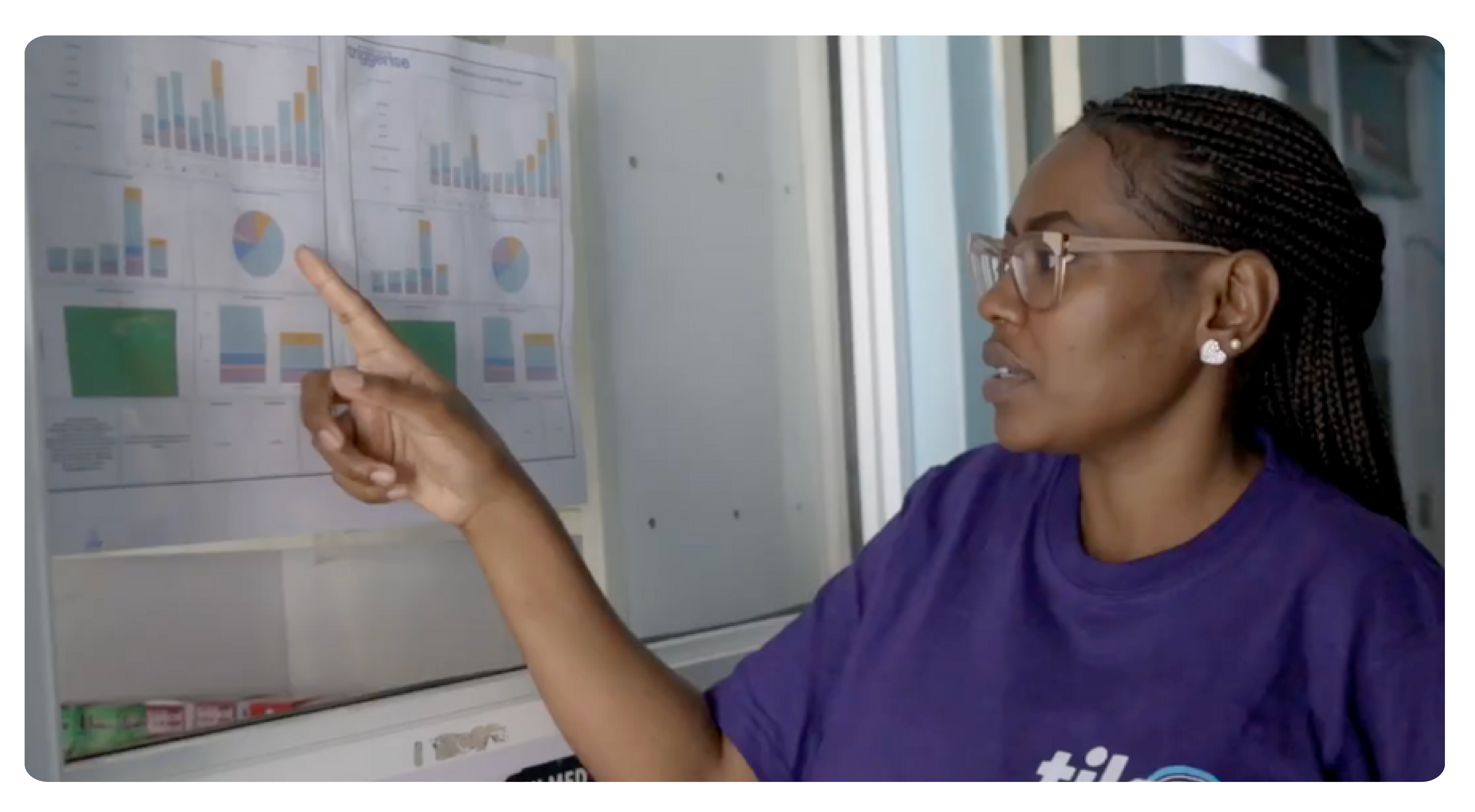
We also developed a diagnostic tool to interrogate data accuracy, alignment with the family planning sector, understandability, and the quality of data visualization in the dashboards:
User experience. We conducted a dozen interviews with Tiko team members and donors to research their involvement in dashboard design and the user experience. We wanted to know if the dashboards met expectations, were useful for decision-making, if there were any pain points, and what was most critical to improve.
Findings. Our research revealed that clients appreciated how dashboards displayed baseline data and supported real-time monitoring. However, the dashboards did not always meet team and donor needs and some donors wanted to be more involved in the design process. “When I look at the dashboard, I want to be able to tell if the program and investment were worth it,” explained one donor. Tiko’s team also wanted to increase donors’ involvement during the design process. We identified inconsistencies within and across dashboards, and gaps in the dashboard development process. We compiled our findings, determined the root cause for each challenge, and reviewed the results with Tiko’s leadership. We also collaborated with Tiko to identify a set of quick wins and longer-term solutions.
TOOL DEVELOPMENT
Aligned measurement and metrics
To help Tiko standardize its data, we developed a MERL (Monitoring, Evaluation, Research, and Learning) Reference Guide and a data dictionary. These tools were designed to serve as a repository of all definitions for all indicators, variables, labels, and abbreviations, ensuring consistent usage in dashboards, proposals, and other business communications. They can also be used to onboard new staff.

CAPACITY BUILDING
Evidence to inform decision-making
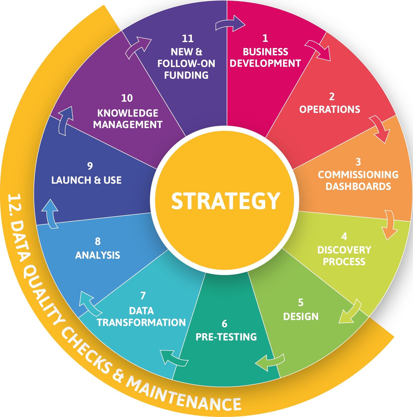
Our research revealed that Tiko followed a four-step process to develop dashboards:
This abbreviated process was the root cause for many of the dashboard design and use issues
identified in our research.
Our recommendation? Expand this process to 12 steps to incorporate best practices from design thinking (discovery process, design, pre-testing, and analysis) and information science (data quality checks and maintenance, knowledge management), and integrate dashboard development into core business operations to form a continuous lifecycle:
IMPACT
 Tiko implemented a number of “quick wins.” For example, they moved their data team—which includes sector experts— into the technology group to deepen collaboration during the development of data visualizations. The organization also adopted the data dictionary and is using the same variables, terms, and abbreviations across all dashboards and communications.
Following these changes, Tiko won a grant to fund a project with a new donor. Before designing the dashboard for the new project, the team conducted a discovery process with the donor to better understand their needs and what information was most important to include. The team then shared an initial design with the donor and iterated the design based on the donor’s feedback. Ultimately, the donor expressed satisfaction with the development process and the final design. “I can already see improvements,” said Hildah Essendi, Tiko’s Director of Monitoring, Evaluation, Research, and Learning.
Acknowledgements: Thank you to Tiko, Dani Lloyd, and Andrea Rowen for their review and inputs. This case study was written by Kim Longfield, Rebecca Pallant (Databoom) and Amy Lynn Grossman (Thinking Hound) and designed by FLUYT.